Redesign of Goodreads
Year
2024
Type
Redesign, Web interface
Role
UX/UI designer
Problem
I use Goodreads to track what I read, but over time I started noticing how much the interface gets in the way of simple tasks. The site feels visually dated, crowded with competing elements, and often makes it harder than necessary to find books, manage reading lists, or understand what to focus on.
Solution
I redesigned the Goodreads website with a focus on simplifying the interface, improving content hierarchy, and making the core reading and discovery flows easier to navigate. The goal was to preserve the functionality people already rely on while making the experience feel clearer and more contemporary.

Signup / Log in (Before)
The problems I found in these screens are:
1) Too much empty space. The screen has a significant amount of unused space that could be used to communicate product value, highlight key benefits, or add social proof to increase user interest and engagement
2) Sign-in option is too far down the page. The sign-in option for existing users is placed at the very bottom of the screen, making an important alternative path less visible and increasing the effort required to switch between sign-up and sign-in
3) Password recovery is not placed where users expect it. The “Forgot your password?” action is positioned away from the password field, which makes it less discoverable and breaks a familiar interaction pattern users typically expect in authentication flows
4) “Keep me signed in” is disconnected from the main flow. The option to stay signed in is placed too far from the login fields and primary action, weakening its contextual relationship with the sign-in process and making it easier to overlook
Signup / Log in (After)
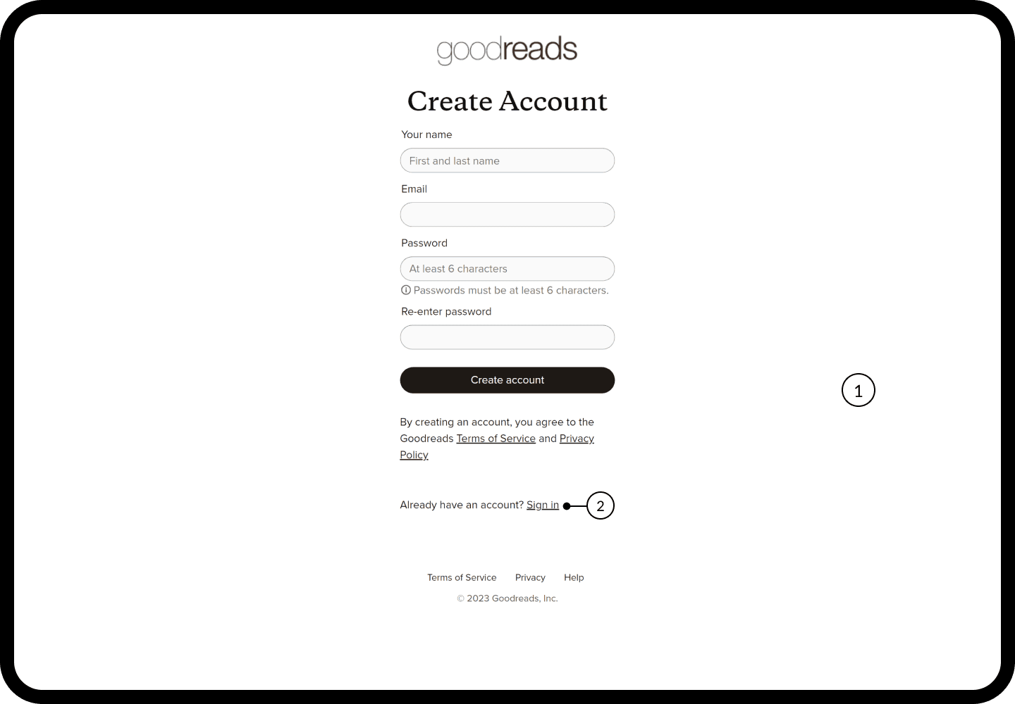
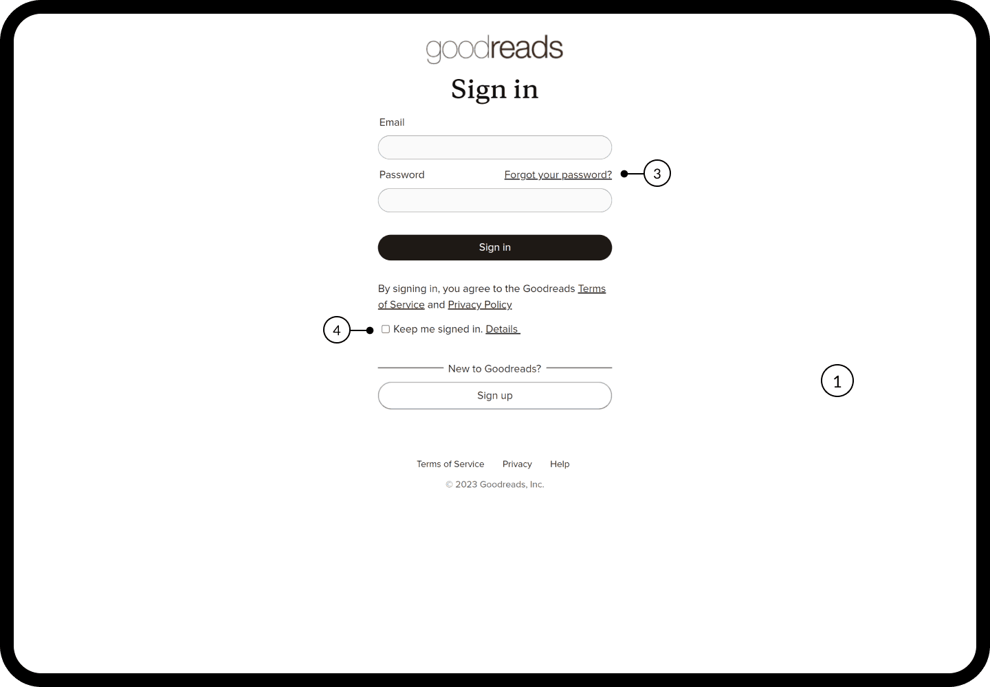
The problems I found in these screens are:
1) Use empty space to support the experience. The unused area was turned into a branded visual section, making the screen feel more balanced while adding personality and reinforcing the product’s identity.
2) Make switching between sign in and sign up easier. The alternative authentication path is placed directly below the page title, allowing users to quickly switch between creating an account and signing in without searching for the option.
3) Add alternative sign-in options. Social sign-in options were added to give users a faster way to access the product and reduce the effort required to complete the authentication process.
4) Provide a clear way to exit the flow. A visible close action was added to give users more control and allow them to leave the authentication flow without relying on browser navigation.


Onboarding (Before)
The problems I found in these screens are:
1) Too much empty space. The screens leave a large amount of unused space without supporting the onboarding experience. This space could be used for helpful content that guides users toward faster decisions, reduces unnecessary scrolling, and minimizes the number of interactions required to complete each step.
2) Lack of a progress indicator. Users are not shown where they are in the onboarding process or how many steps remain. Adding a clear progress indicator would set expectations, reduce uncertainty, and make the flow feel easier to complete.


Onboarding (After)
The problems I found in these screens are:
1) Add a progress indicator. A clear step-by-step progress indicator helps users understand where they are in the onboarding flow, what has already been completed, and how many steps are left.
2) Make steps skippable. A visible “Skip this step” action gives users more control over the onboarding process and allows them to move forward without being forced to complete non-essential steps.
3) Allow users to go back. A back action was added so users can easily return to the previous step, review their choices, and make changes without restarting the onboarding flow.
4) Show more books at once. The book selection was redesigned into a denser grid layout, allowing users to scan and compare more options on a single screen while reducing unnecessary scrolling and helping them make selections faster.


Main page (Before)
The problems I found in these screens are:
1) Unclear navigation icons. The meaning of several navigation icons is not immediately obvious, which reduces discoverability and can create hesitation when users try to understand where each action will lead.
2) Confusing button behavior. It is not always clear how some buttons work or what will happen after clicking them. Their labels and visual treatment do not provide enough context, which can make users hesitate before taking action.
3) Outdated and visually dense interface. The page combines a large amount of content with weak visual hierarchy and inconsistent spacing, making it difficult to scan and prioritize information. A more modern structure could improve readability, simplify navigation, and help users focus on the most relevant content.

Main page (After)
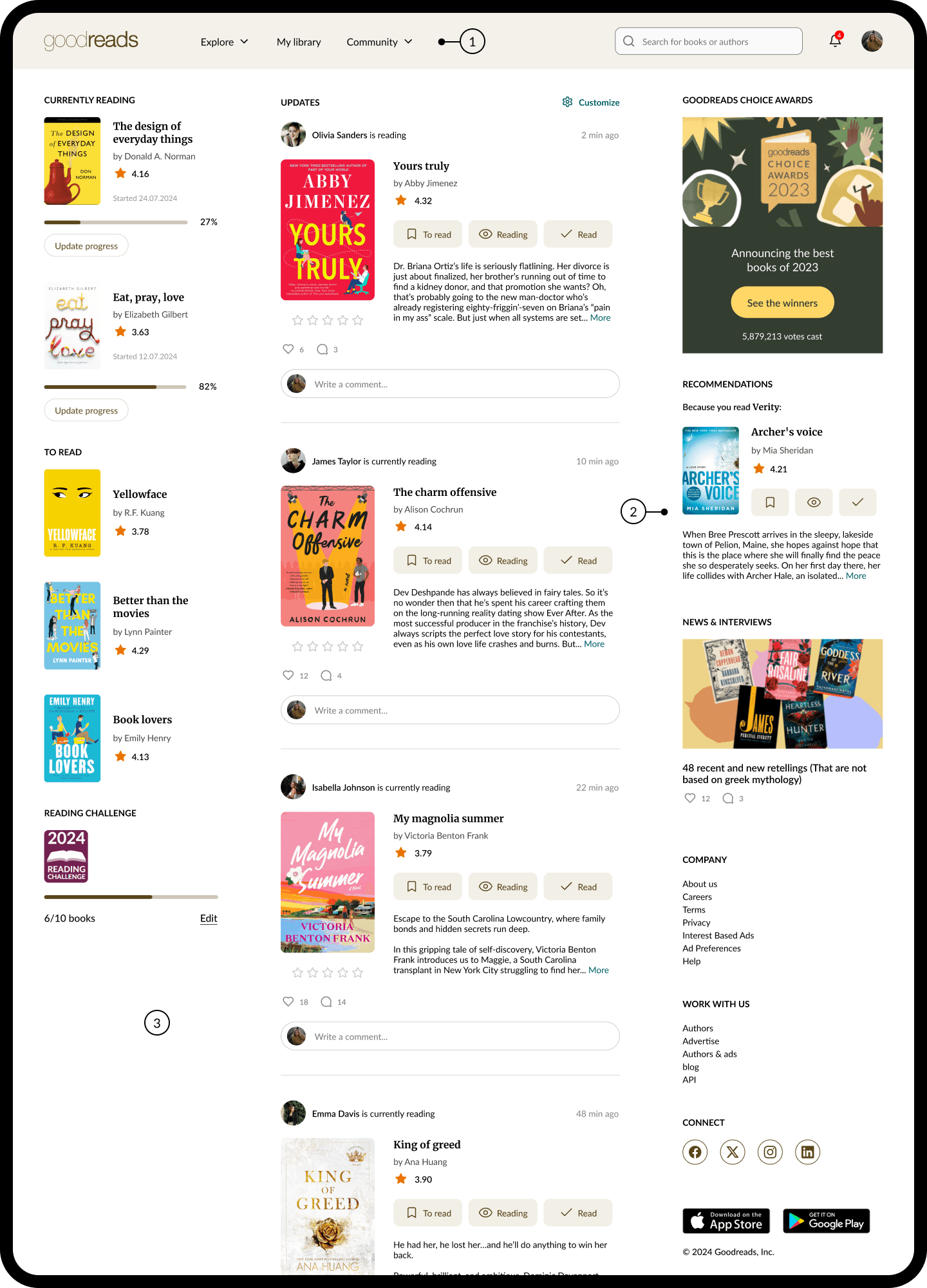
The problems I found in these screens are:
1) Improved navigation. The top navigation was simplified and reorganized to make key sections easier to find and understand. Clear text labels and a more focused structure reduce ambiguity and help users move through the product more confidently.
2) Redesigned book cards. Book cards were restructured to surface the most useful information at a glance, including ratings, descriptions, reading status, and progress-related actions. Clearer controls such as “To read”, “Reading”, and “Read” make it easier to understand and update a book’s status directly from the feed.
3) Updated interface and content hierarchy. The page was redesigned with clearer spacing, stronger visual hierarchy, and more consistent components. This makes the interface easier to scan, helps users focus on relevant content, and creates a more modern and cohesive overall experience.
Book details (Before)
The problems I found in these screens are:
1) Unclear content structure. Important book information is presented with limited hierarchy, making it harder to quickly understand what matters most. The description, metadata, editions, and secondary details compete for attention instead of guiding users through the content in a clear order.
2) Outdated interface. The page feels visually dated and dense, with inconsistent spacing, typography, and component styling. This makes the experience harder to scan and reduces focus on the key actions and information users are most likely to need.

Book details (After)
The problems I found in these screens are:
1) Organize book information into tabs. The content was divided into clear sections such as About the book, Reviews, Author, Editions, Discussions, and Similar books. This makes the page easier to scan and helps users quickly access the information they are looking for without scrolling through a long page.
2) Make reading status easier to update. The reading status controls were moved into a clear, visible group, allowing users to quickly switch between “To read”, “Reading”, and “Read” directly from the book details page.
3) Update the interface and visual hierarchy. The page was redesigned with clearer spacing, more consistent components, and a stronger content hierarchy. This makes key information and actions easier to find while creating a cleaner and more modern reading experience.

Bookshelf (Before)
The problems I found in these screens are:
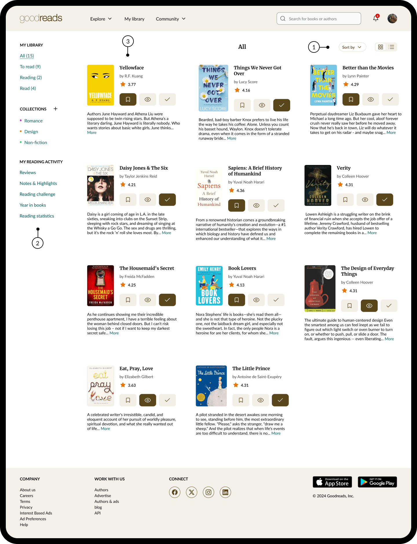
1) Unclear utility actions. Several controls are presented without enough context or clear prioritization, making it difficult to understand which actions are useful for managing the bookshelf and when they should be used.
2) Confusing navigation structure. Bookshelves, reading activity, recommendations, and tools are grouped together in a dense side navigation. This makes the structure harder to scan and increases the effort required to find the right section or action.
3) Sorting controls are easy to miss. Sorting options are placed below the book grid, where users may not expect to find them. This reduces discoverability and makes reorganizing or filtering the bookshelf less efficient.

Bookshelf (After)
The problems I found in these screens are:
1) Improve book view controls. Sorting and view options were moved to a more visible position at the top of the library, making it easier for users to organize their books and switch between different layouts.
2) Simplify library navigation. The sidebar was restructured into clearer groups for reading status, collections, and reading activity. This makes the library easier to scan and helps users reach the right section faster.
3) Show more useful book information. Each book card now includes key details such as author, rating, description, and reading status controls. This gives users more context directly in the library and reduces the need to open each book separately.